KAUAI LOGO DESIGN PORTFOLIO
KAUAI LOGO DESIGN SHOWCASE
KAUAI LOGO DESIGN
The Kauai logo design showcase captures the essence of the Hawaiian island’s beauty and culture in a vibrant emblem. Drawing inspiration from its lush landscapes, azure waters, and rich heritage, the logo reflects the spirit of Kauai’s enchanting allure. With its harmonious blend of colors and symbolic elements, the design evokes a sense of serenity and adventure, inviting visitors to explore its wonders.

KAUAI LOGO
KAUAI LOGO DESIGN
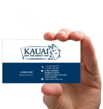
Designing a logo for a fish market company, such as Kauai, involves several key considerations. The logo should effectively communicate the brand’s identity, values, and offerings to its target audience. In this case, the inclusion of a fish drawing within the logo is a clear nod to the company’s focus on seafood products. It instantly communicates the nature of the business to potential customers.
The choice of the brand name “Kauai” can evoke associations with freshness, exoticism, and perhaps a connection to the sea, depending on the intended brand positioning. Additionally, the slogan accompanying the logo plays a crucial role in further reinforcing the brand message. It could emphasize the quality of the products, the company’s commitment to sustainability, or any other unique selling proposition that sets Kauai apart from its competitors.
Overall, the logo designed by Wadi Graphic for the fish market company Kauai appears to effectively capture the essence of the brand and its offerings, providing a visually appealing and memorable representation for the company in the market.
The logo styles, (image + text.) The top 3 things that communicate through this
logo are:
+ Casual yet professional
+ Simplistic
+ Inspiring.
Client Details:
Client: KAUAI LOGO
Category: Logo Design
Date: March 2016


