APP DESIGN
Understanding Responsive Design
Responsive design ensures that a website or application adapts to different screen sizes and device types, providing an optimal viewing and interaction experience. This means that whether the user accesses the site from a desktop, tablet, or smartphone, the layout, images, and functionalities should adjust smoothly.
Key Principles of Responsive Design
1. Fluid Grid Layouts: Use a fluid grid system that allows content to resize and reposition itself dynamically. This involves using relative units like percentages rather than fixed units like pixels.
2. Flexible Images: Ensure that images scale appropriately within their containing elements. Use CSS techniques such as max-width: 100% to make images responsive.
3. Media Queries: Implement CSS media queries to apply different styles based on the device’s characteristics, such as width, height, and resolution. This allows for custom styling on different devices.
4. Viewport Meta Tag: Include the viewport meta tag in your HTML to control the layout on mobile browsers. For example:
<meta name="viewport" content="width=device-width, initial-scale=1.0">
Steps to Design a Responsive WordPress App
1. Research and Planning:
• Understand the target audience and the devices they are likely to use.
• Define the primary goals and functionalities of the app.
2. Wireframing and Prototyping:
• Create wireframes for different screen sizes to visualize the layout.
• Use tools like Adobe XD, Sketch, or Figma to create interactive prototypes.
3. Choosing a Responsive Theme:
• Select a WordPress theme that is designed with responsiveness in mind. Themes from
reputable sources like the WordPress repository, ThemeForest, or Elegant Themes are good options.
• Verify the theme’s responsiveness by testing it on multiple devices.
4. Customizing the Theme:
• Use the WordPress Customizer to make adjustments.
• If needed, edit the theme’s CSS to ensure responsive behavior.
• Use page builders like Elementor or WPBakery, which have built
in responsive design controls.
5. Developing Custom Features:
• Use responsive frameworks like Bootstrap or Foundation for custom component development.
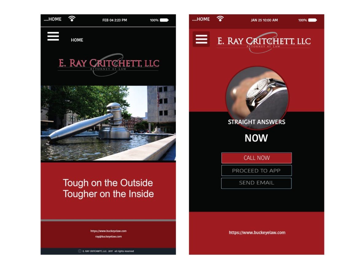
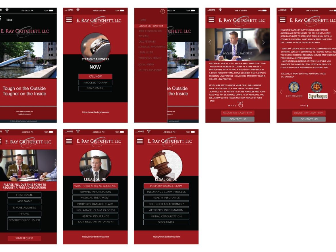
• Implement responsive navigation menus that collapse into a mobile-friendly format (hamburger menu) on smaller screens.
6. Testing:
• Test the design on various devices and screen sizes. Use tools like BrowserStack or Responsinator to see how the site looks across different environments.
• Ensure that all interactive elements (buttons, forms, etc.) are easily usable on touchscreens.
7. Performance Optimization:
• Optimize images for faster loading on mobile devices using formats like WebP.
• Minimize CSS and JavaScript to reduce load times.
• Implement lazy loading for images and videos.
8. Ongoing Maintenance:
• Regularly update the theme and plugins to ensure compatibility and security.
• Monitor site performance and user feedback to make continuous improvements.